Website Colour Psychology: Choosing Colours That Convert
 By Codeventure Infotech
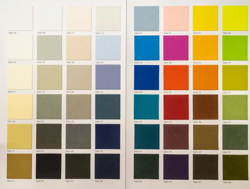
Before visitors read a word of your homepage, colour has already shaped their first impression. That isn’t marketing folklore; the eye simply registers colour before text. On a business website, your colours are doing real work whether you planned them or not.
Colour is a trust signal
Within seconds of a page loading, visitors make a rough “is this legitimate?” judgement, and the colour palette is one of the biggest inputs. A clashing, inconsistent or dated scheme quietly undermines trust before anyone has looked at your services. Fair or not, it reads as a sign of how careful the business is.
What colours tend to communicate
- Blue: trust, stability and professionalism, which is why banks, hospitals and B2B firms use it so often.
- Green: growth, health and calm, common for wellness, agriculture, sustainability and finance.
- Red: urgency, energy and appetite. Great for buttons and food brands, overwhelming as a main background.
- Black and deep navy: premium and authoritative, popular with luxury and professional services, but cold without a warmer accent.
- Orange and yellow: friendly, approachable and energetic, for consumer brands that don’t want to feel corporate.
Culture adds another layer. In India, for example, saffron, red and gold carry festive and traditional meanings, while white is linked with peace and purity. If you sell to several countries, check that your palette doesn’t send an unintended message in any of them.
These associations are real but not absolute. A well-executed palette in an unusual colour can still work; a poorly executed one in the “right” colour won’t.
Consistency beats correctness
A website that uses the same two or three core colours deliberately, everywhere, looks more professional than one that follows colour psychology rules but applies them inconsistently. Choose a small palette and stick to it.
Make your button colour do its job
Whatever colour you pick for buttons and calls to action, it should appear less than any other colour on the page, so it pulls the eye exactly where you want people to act. A button that blends into a similar background is one of the easiest conversion leaks to fix.
Respect, or deliberately break, industry norms
Visitors arrive with expectations shaped by similar businesses. A landscaping company in grey instead of green, or a law firm in bright orange, isn’t wrong, but it’s a bold choice that the rest of the design has to support.
A quick self-check
Look at your site with fresh eyes. Can you name its two or three core colours without checking? If not, the problem usually isn’t the wrong colours; it’s too many of them used inconsistently. Read what makes a website look trustworthy for the other signals that work alongside colour, or ask us for a free design review. Our graphic design team can also build you a consistent brand palette.
Frequently asked questions
Should I follow the usual colours for my industry?
It’s a sensible default because it matches what visitors expect, but it isn’t mandatory. A distinctive palette can help you stand out, as long as it’s applied consistently and still sets the right tone.
How many colours should a website use?
Most effective sites use a small core palette: one main brand colour, one accent for buttons and calls to action, and neutrals for text and backgrounds.
Does colour really affect conversion rates?
Indirectly but noticeably. Colour affects trust and readability, and a button colour that clearly stands out from its surroundings is easier to notice and click.