Mobile-First Web Design: Why It’s No Longer Optional
 By Codeventure Infotech

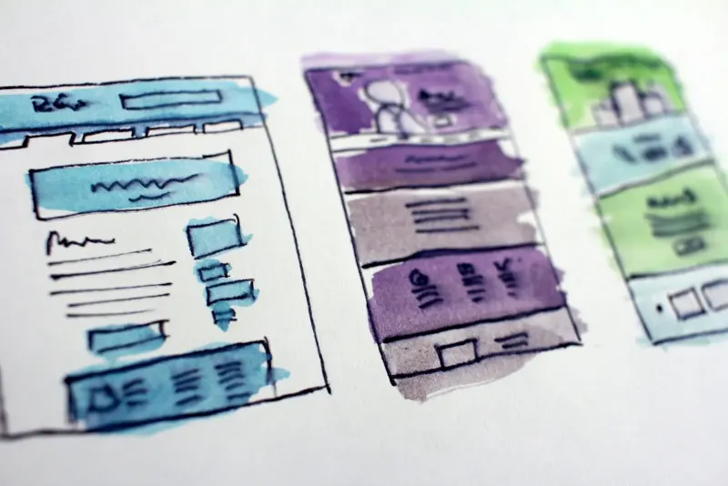
“Mobile-friendly” used to mean a desktop website that also worked reasonably on a phone. Mobile-first is a stricter standard: the mobile version is designed as the main experience, and the desktop version is the expanded layout, not the other way round.
Why things changed
For most businesses, the majority of website visits now come from phones. In India especially, many customers have only ever used the internet on a smartphone, often over mobile data. Google has followed the same shift: it uses the mobile version of your site as the main basis for ranking, not the desktop version.
What mobile-first looks like in practice
- Content ordered by importance, not just shrunk to fit. What you do and how to contact you come first, not after decorative sections.
- Buttons sized for thumbs, not mouse pointers, with enough space around them to tap accurately.
- Fast loading on real mobile connections, not just office Wi-Fi. Heavy, unoptimised images are the usual culprit.
- Forms built for phone keyboards, so a phone number or PIN code field brings up the number pad.
- Tap-to-call and WhatsApp links that open the right app in one touch.
- No sideways scrolling or overlapping elements at any screen size.
A test you can do right now
Open your website on your phone using mobile data and try to do exactly what you want customers to do: call you, send an enquiry, view a service or buy a product. If any step is slow, awkward or needs zooming, that’s a real leak in your sales funnel.
How it connects to SEO
Mobile experience feeds into the Core Web Vitals that Google uses in ranking. A genuinely mobile-first site tends to score better across the board, not because of one setting, but because the same discipline of being fast, focused and uncluttered improves several signals at once.
The bottom line
“It mostly works on a phone” is no longer good enough for either your customers or your search visibility. Every website we design starts from the mobile layout for exactly this reason; see our website design services.
Frequently asked questions
How do I check whether my site is mobile-friendly?
The most reliable test is to open it on your own phone using mobile data, not Wi-Fi, and try to complete a real task as a customer would.
Does mobile-first design make the desktop version worse?
No. The mobile layout becomes the design priority, and the desktop version expands on the same clear structure rather than being a separate design.
Is mobile-friendliness really a ranking factor?
Yes. Google uses the mobile version of your site as the main basis for indexing and ranking, so a poor mobile experience can hold back your whole site’s visibility.